LBRY Joule for Desktop
Samuel Bryan • Jan 22 2020
Introducing a High-Energy Homepage, Improved ERGonomics, and More Changes that Will Make You Say Watt?!
Today, LBRY releases LBRY Joule for Windows, macOS, and Linux. This new release adds a brand new homepage, improved navigation, and more.
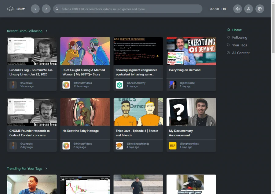
The new homepage brings larger tiles and offers a mix of content, rather than a single, specific view. The homepage view will look different depending on the number of channels and tags you follow. In general, the navigation has made it easier and clearer how to get back to content you like, as well as content you create.
A typical homepage view might show:
- Latest content from channels you follow
- Trending for tags you follow
- Content trending across the network
- Content tagged #homepagecagematch
- Latest from @lbry channel
We expect to add further customization of the homepage in future updates.

LBRY Joule also includes a revamped Invites area as part of a larger update to Invites for lbry.tv account holders. This will be shared in more detail in a separate announcement, but you are welcome to check it out and use them now.
More about LBRY Joule
- Revamped homepage. Homepage uses grid display with images to display a variety of claim filters, such as new content from your follows or trending across the network.
- Improved navigation in the sidebar and header.
- Improved display and handling of text content including markdown.
- Now released via AppImage for Linux users.
- The cursor automatically hides on full screen videos.
- Fixed issues with the color profile on some Linux distributions.
- Fixed issues around sign in occasionally getting inappropriately stuck.
- Fixed issues with app crashes on some content edits. Fixed some other minor presentation bugs around editing.
For the full release notes, visit GitHub.
For a limited time, enter custom reward code lbry-joule-buzz to zap a little LBC into your wallet.
