LBRY Austen: A Developers Perspective
Sean Yesmunt • Jun 25 2018
About 4 months ago a user by the name of @nizuka told us he had been working on a redesign for our desktop app and posted a link to a demo he made in one of our Slack channels (RIP LBRY Slack, checkout our Discord). This wasn't solicited and I'm not sure we had any immediate plans for a redesign at that time, but It was awesome. I think pretty much right away, everyone knew we should start working towards a new app design.
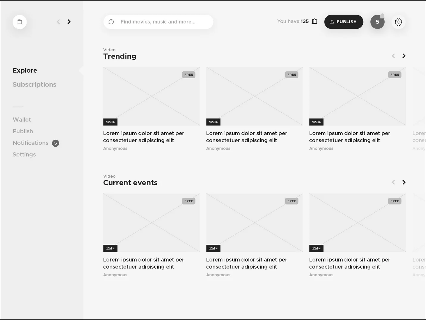
This happened shortly after I had joined LBRY full time. My main task since I started has been working with Nicolas to implement this new design. Initially we had a few brainstorming meetings to discuss what we could improve on his initial demo. He began coming back with some killer mockups and the project was officially underway. Once we were happy with the design, Nicolas created a web demo to share to the community.
While all of this was happening, I had started working on some of the initial refactoring inside our app. There were a few React components that had tons of internal state and it was making it tough to add new features and reproduce bugs. The publish page was one of the worst offenders. We have moved most of this logic into redux and which has allowed us to do some cool things such as remembering where you were in the publish process if you leave the screen, and it has made it a lot easier to prefill the publish form if you are editing claims. We plan to re-work the UX for publishing, and this was a needed first step.
Another piece we wanted to improve was our CSS architecture. The app is now (mostly) conforming to BEM naming patterns, which has made it really easy to ensure styles are the same for similar components across the app.
As the redesign was taking place, we added Flow to the project. We are slowly adding types to more components and functions, and we quickly saw the benefits of doing so. We aren't all the way there, but we are continuing to increase Flow coverage as we add new features.
This project has been incredibly fun and rewarding to work on, but it has not been without issues. It was hard to know when to stop refactoring older components and when to stop and move on. I found it very easy to keep diving deeper into the code until I realized maybe my time would be better spent continuing to work on the actual redesign. These were changes that made parts of the code easier to work with for the future, but I think this could have been finished sooner if I focused on actual design changes more. Another issue I quickly ran into was how to keep the project up to date. The LBRY app is constantly being worked on by many contributors (team members, and community members) and I realized it would be a pain to constantly keep resolving merge conflicts as I tried to keep my branch up to date. I eventually decided just to wait until I was ready to merge my initial PR into master, and solve the 80+ conflicts then. I'm sure this could be handled better.
Here are a few photos to see some of the changes we've made.
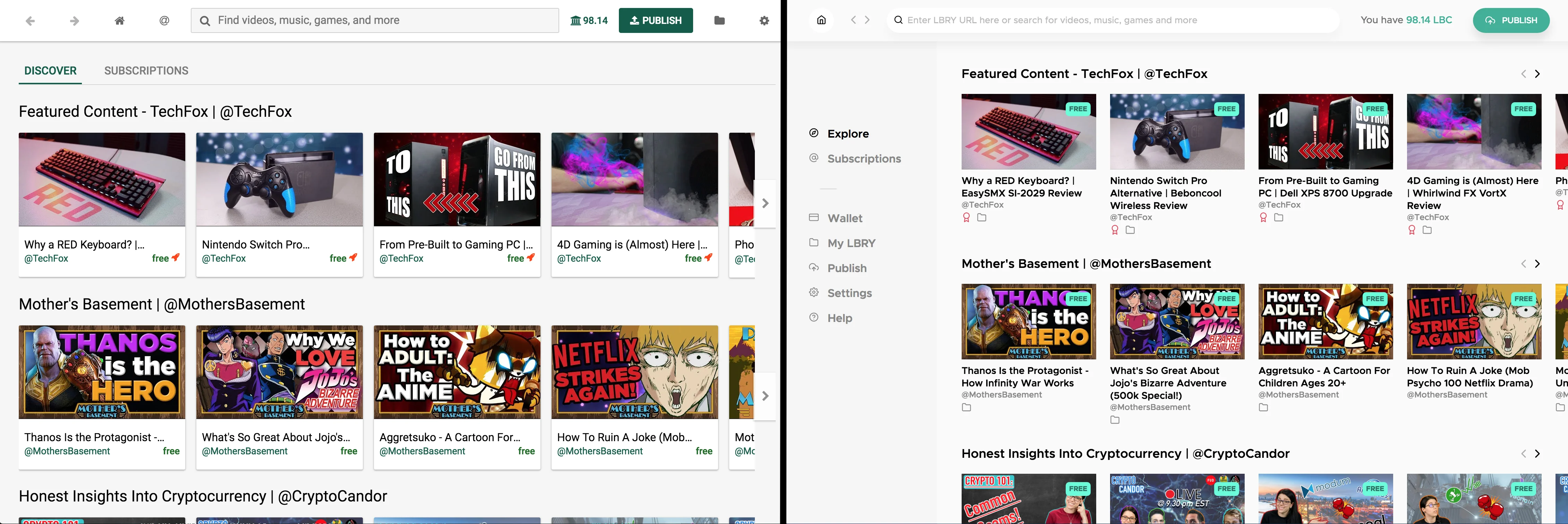
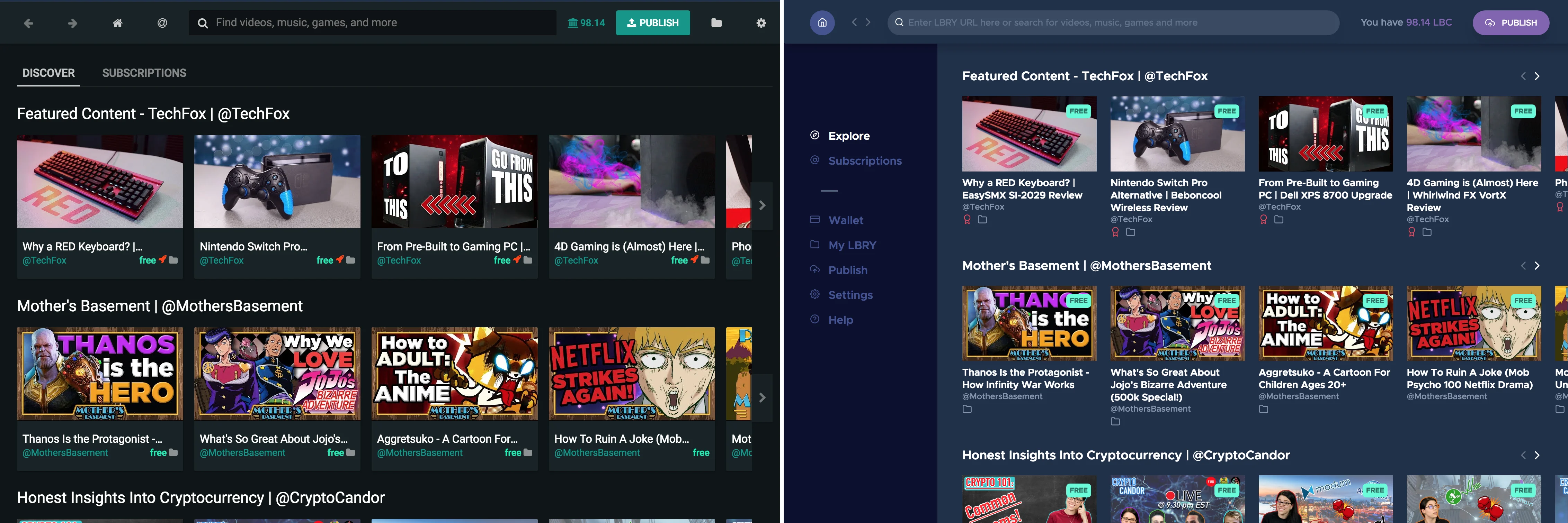
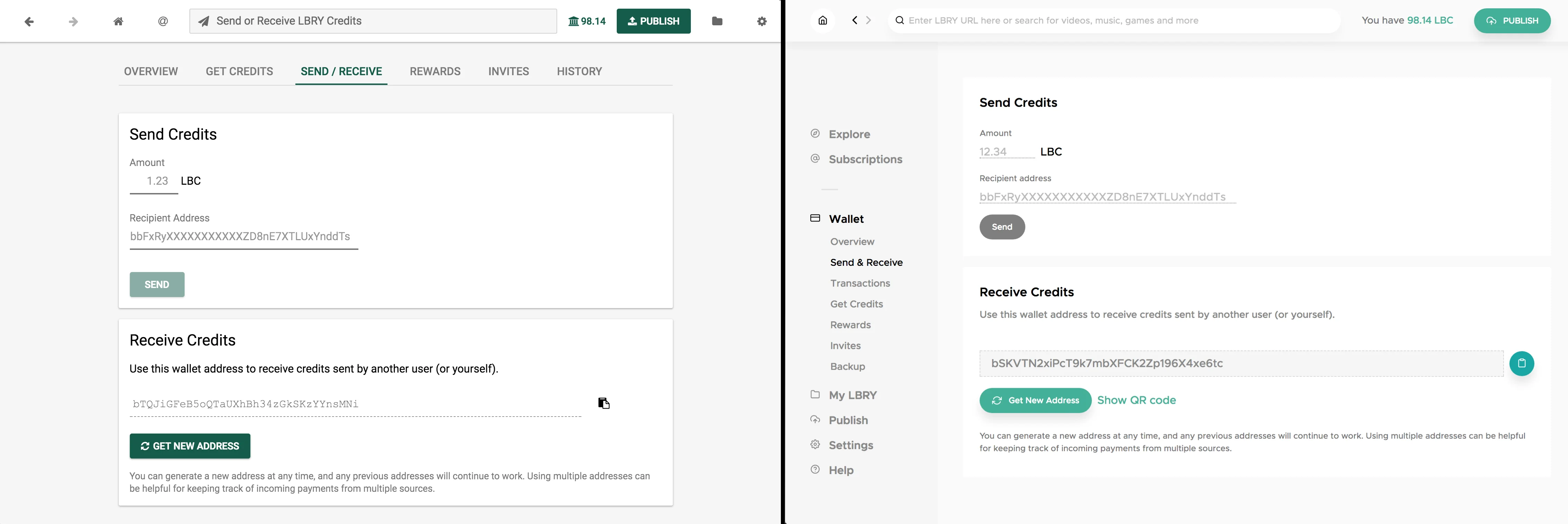
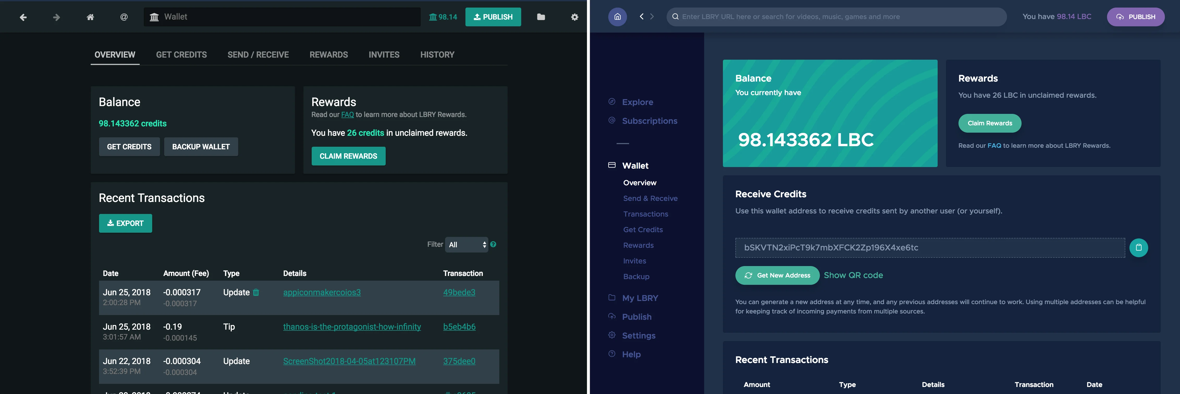
This redesign has been a large project with tons of help from LBRY team members and several community members. We had many code contributions from the community and a lot of help with early testing. The first release is far from our final design, but we see it as a good first step. We would rather release early and release often. Is there something about the redesign that you don't like? Have you run into any issues? Please let us know! We will even pay you with some LBC if you are interested in fixing the issue. We love community feedback and contributions, that is how this entire redesign project got started. :)
